Balancing Connection and Privacy in Student Housing

What makes an ideal design for student housing? The right balance between connection and privacy.

In modern practices of student housing design, common areas have become increasingly important as they create opportunities for students to socialize and collaborate. While the need for private spaces is still significant, students value the availability of an open communal living space that allows them to interact with each others. 

For our student apartment project at Everett Community College, we have come up with a design approach that balances the need for privacy with the need of creating community. To create a socially-oriented shared living experience, we incorporate various common areas into our design, including an ground-level open interior courtyard that will provide an open environment for students to hang out and enjoy the outdoors. The units will be arranged along an open circulation path that surrounds the interior courtyard, giving students an all-around view of the building while fostering a strong sense of community.

Interior courtyard rendering

Interior courtyard rendering

The building will include studio units, as well as three- and four-bedroom units with communal living space. Along with a modern open layout, large windows inside units will let in daylight and create a light-filled, airy living environment. 

Studio bedroom rendering

Studio bedroom rendering

All three- and four-bedroom units will include a shared modern kitchen and a spacious communal living room, which will draw students out of their individual units and encourage interaction. 

Three bedroom unit rendering 

Three bedroom unit rendering 

Four bedroom unit rendering

Four bedroom unit rendering

The design of student housing plays a critical role in shaping student's college experience. Our design offers a balanced mix of private and social spaces, which will support students both academically and socially by meeting their needs for privacy and connection. 

More renderings and updates for this project are coming soon, stay tuned! 

Urban Residential Living at West Covina

We're so excited to present our latest senior housing development on the West Coast: Merrill Gardens at West Covina!

Located in the foothill of San Gabriel Mountains, California, this project is just minutes away from Downtown Los Angeles. One feature that makes this project truly unique is its integration with the surrounding community. Designed according to the city’s master plan emphasizing new urbanism concepts, the building features highly-prominent facades and pedestrian-oriented open spaces. Along with modern architectural details and a 9,247 sf multi-tiered rooftop terrace, this building offers a variety of amenity-rich spaces, allowing residents to enjoy a dynamic urban lifestyle. 

W Covina View 5 (2).jpg

See more photos for this project on our portfolio page

Rooftop Oasis: 6 Designs that Bring the Outdoors In

1.     Extend the outdoor spaces

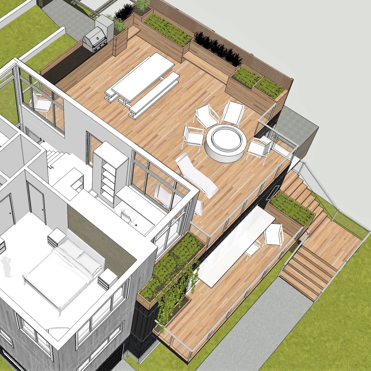
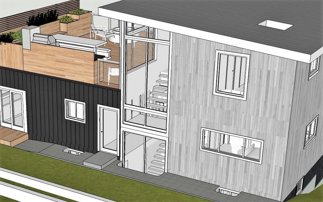
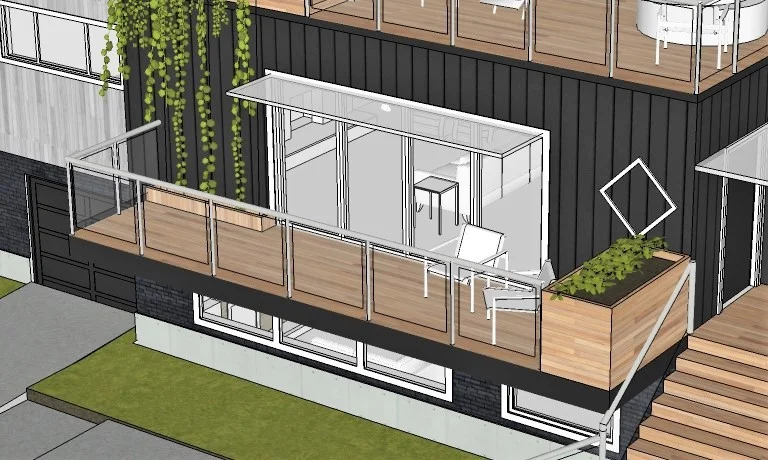
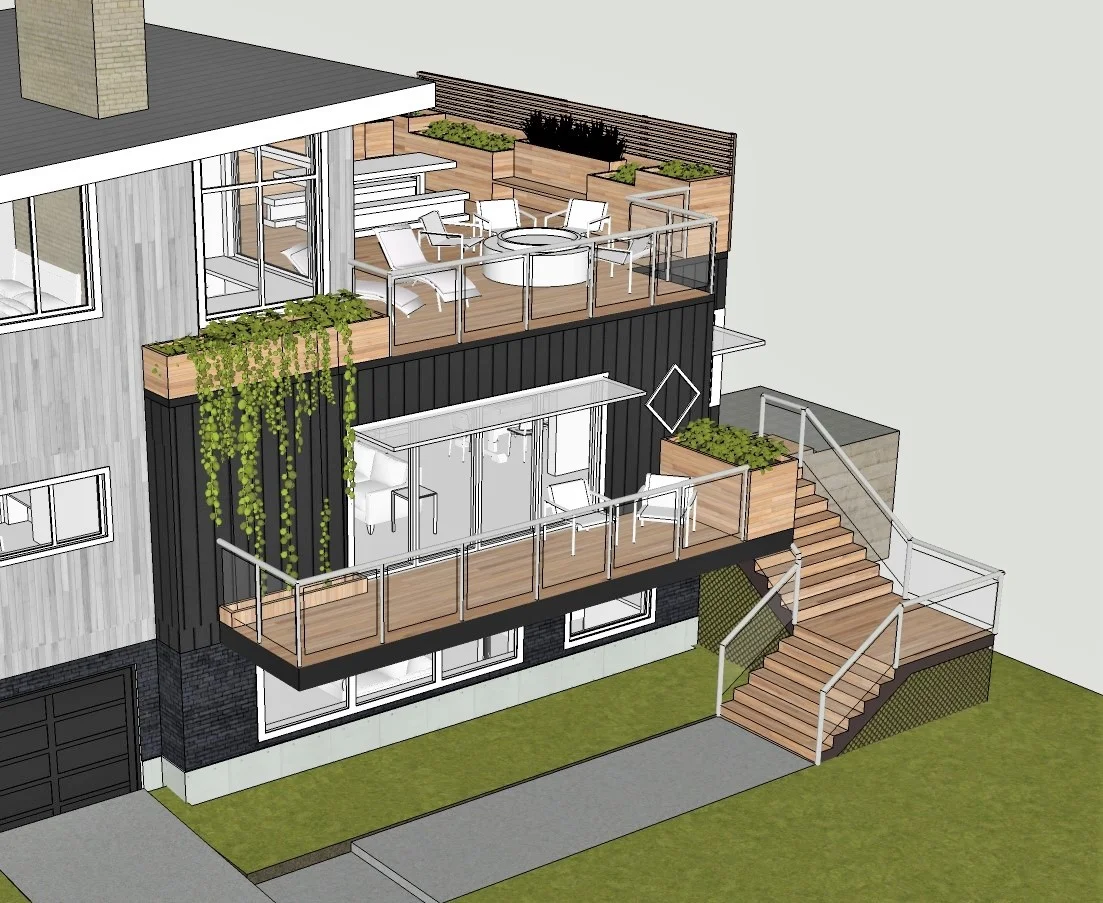
Extend living space with outdoor features like decks, patios or balconies can quickly connect the indoors and outdoors. To improve the outdoor connection of the View Ridge house, we added a balcony to the existing first floor and a roof deck on the additional second floor. Not only will these additional outdoor spaces provide extra areas for gathering and outdoor dining, but they will also provide the family an exclusive outdoor view of Mount Rainier. 

2.     Add large or floor-to-ceiling windows

Windows bring the outdoors in by maximizing views and light. By adding a floor-to-ceiling window next to the relocated staircase, a flood of natural light will be brought into the entire house. Large and wide windows are also used in the new office and master suite to brighten up the interior space. A room filled with sunlight and vitamin D can make you feel positive, but most importantly, these windows will greatly benefit the overall energy efficiency of the house by reducing operating costs.   

4.    Give the workspace a view

Incorporating outdoor elements in your office can help keep the creative juice flowing. To take full advantage of the spectacular Mount Rainier view, we moved the existing office space upstairs and added an around-the-corner windows next by the work desk. In addition to lightening up the interior space, the windows will make the office and the roof deck feel more interconnected.

3.     Use doors to blend the indoors and out

Proper use of sliding glass doors can create immediate outdoor connection and let in extra natural light. We added a sliding glass door to open the living room right up to the balcony and let the breeze in. The sliding door will not only offer the living room visual and spatial continuity with the outdoors, it will also help lightening up the entire floor by bringing in more natural light.

5.     Take down unnecessary walls

When placed in improper locations, walls can cut off the outdoor connection of your home by limiting views and natural light. To maximize the flow of natural light, we tore down the full-height wall at the rear of the existing living room, allowing the living room to smoothly connect to the dining room, into the kitchen and out to the back yard. The removal of the wall also creates a seamless flow from the front to the back of the house.

6.     Use planters as decors

Incorporating nature in home’s décors with planters is another budget-friendly way to bring the outdoors inside. To give the overall design an organic touch, we decorated the additional roof deck and balcony with some wood panel planters. The color green is shown to reduce anxiety, while being around plants is believed to improve memory and productivity. If you are looking for some functional decorations, try adding some house plants to give your home a fresh look!